Friday, March 26, 2010

Desire and Spring Fling (new sock yarn colors)

These last two colors bring the total number of colorways up to 15.  I think that is a good place to stop momentarily.  Besides, I need to place another yarn order.  Funny how those work together like that.  

My favorite colors are (usually) the warmer ones like red and purple.  So, that I created a colorway like Desire with multiple reds, pink, and orange does not surprise me.  What I find amazing is the way the colors harmonize together.  When I was dying the yarn--I liked these colors.  When I was rinsing the yarn--I loved these colors.  When the yarn was dry--I was smitten.  Desire.


Desire


Spring Fling seemed to happen of its own accord.  I'm guessing that the gorgeous weather we had last weekend was stuck in my mind.  It was a grey and drizzling rainy kind of day I dyed it.  It reminds me not just of spring in general but more specifically of some of the daffodil varieties.  You know, the ones that have the apricot colored centers instead of being all yellow.  


Spring Fling


These are both available in my shop (banner links are at top and bottom of the page).  And will join the other High Society Sock Yarn colors on that page shortly.  

Tuesday, March 16, 2010

Dyer's Notes: Polo Ponies and Uptown Girl

I think I've mentioned my favorite colors before.  However, on the off chance that I only think I did just let me say that the color at the top of the favorites pile is PURPLE.  There are other colors on that pile too.  Colors like fuchsia, pink, hot pink, magenta, red, scarlet, crimson, electric blue, turquoise, teal, peacock blue, and aquamarine.  Of course, most of those color words are synonyms for pink, red, and turquoise.  This is not to say that I don't like other colors.  In fact I like most colors.  But, if I am making choices purple will almost always be first and followed closely by those other three colors.  After that, it's a crap shoot.  Suffice it to say, brighter is better for me.

I have used my purple dye in a number of yarns.  Most notably in Sophisticated Schoolgirl, Vineyard, and Opening Night.  However, one of the most recent additions to my ever increasing base dyes is a color called Burgundy.  The first time I used it was when I created Polo Ponies.  I gathered together all the colors that reminded me of the various coat colors of horses.  Black, brown, chestnut, gold, and burgundy.  

"Burgundy?"  You ask. 

Yes, burgundy.  I have always been a fan of bay horses.  Bay is that reddish brown coat color that can range from a blood red to almost black.  The typical bay falls somewhere in the middle.  Red would probably have sufficed but I really wanted to get away from the primary colors for this one.  So, burgundy it was.  I loved the results I got.  The burgundy did in fact sort of hijack this colorway but I like it.  I liked it so much that I wanted to use the burgundy all by itself...almost.  I can't imagine ever having the restraint required to use just one dye and call it quits.  I'm afraid I would have some sort of color-withdrawal and have a seizure.  I'm pretty sure I am color-dependent.

So, I decided to put a rich, dark blue with this rich, dark purple.  Then, just to shake things up a bit; a splash of gold.

While these two look rather different at first glance, they have the same tonal value (lightness/darkness).  And, in the last few pictures you can see how the burgundy is identical.  It really pulls them together quite nicely.  Last year I made a sweater called "Got Gauge" out of Noro's Silk Garden sock yarn.  It was named that because I used three different needle sizes and three different gauges for different parts of the sweater.  Because it started out very differently from how it ended I essentially knit up from the middle and down from the middle.  To be able to write it up as a for-real pattern will require me to do it again and start from somewhere else.  I think I might pair these two up for that...Hmm..

A note on these pictures.  The weather has not been cooperating lately so I had to use a flash.  As a result, the Uptown Girl appears to have more white than it really does.  In reality these two are very close in tonal value.  Uptown Girl is only very slightly lighter.


Can you see where the colors are identical?  Isn't that just a yummy color?  Sorry, I'm a bit biased.  Sort of like a mom about her kids.


Monday, March 15, 2010

Dyer's Notes: Marina del Ray, Opening Night, and New Money

Marina del Ray and Opening Night are very similar in many ways.  They have two main colors in common (Turquoise and Green) as well as some little bits of highlighting that are similar in spots (orange, pink).  However, where Marina is mostly turquoise and green with the highlights, Opening Night is turquoise, green, blue, and purple with larger sections of "splash" and the splash is less blended.  In these cases the splash is fuchsia and yellow and the resulting peach/orange.  They would work well together because of their similarities but they are two very different individuals.  Sort of sisters a few years apart.  Marina is on the left, Opening Night is on the right.


I have included New Money in the comparison equation because she is the other yarn that I have at the moment that falls in the green part of the color wheel.  She is the aloof much older sister to these two.  All the colors used for her are in the yellow and green family.  Just so you can get an idea of how they all stack up against one another, here is a photo of all three.  New Money has weaseled her way in between her younger siblings in an attempt to be the center of attention...


Next post: comparing Polo Ponies to Uptown Girl (they have two distinctive colors in common)...

Friday, March 12, 2010

Comparing Childhood and Primary Race

This is just a quick comparison of two colorways; Childhood and Primary Race.


They are each dyed with three colors.   

Childhood is fuchsia, yellow, and turquoise.  Where the colors overlap bright secondary colors (orange, green, and purple) are formed.  I try to make sure that each of the six resulting colors have equal billing in the resulting skein of yarn.

Primary Race is red, yellow, and blue.  There is not much overlapping of the colors.  A little, but not as much as Childhood.  I was originally going to name this Teen Angst since it is a darker, harsher version of Childhood but when it came time to officially christen this one the primary colors just stood out so strongly.  Especially once re-skeined. 

Here are some side-by-side photos so that you can see the subtle (and not so subtle) differences between the two.


Thursday, March 11, 2010

My Trusty Assistant

Just a few new photos of my 'trusty' assistant, Jaspurr.  He's trusty alright.  You can trust that if you touch the ball winder or swift (both conveniently next to the comfy recliner in the family room) that he will be there.  I like to say that he comes running to the sound of the swift and ball winder the way most cats come running when you touch a can opener.  He is just suddenly there.  He is particularly fond of photo shoots because I prefer to shoot in natural light (cat translation: wherever Mommy is working there is warm sun to lay in) and because there is yarn involved (cat translation: no need to go look for toys or trouble, Mommy has the good stuff with her).


That's my boy!  I just wish I could find a way to get him to like 'crap' acrylic or cotton.  He's become a bigger yarn snob than me (that's saying something!).  His favorite is handspun (of course) followed closely by alpaca, angora, and expensive wool blends.  I should probably be flattered that he goes after my sock yarn.  


Another Day at the Office

I had a busy and productive day today....


Tuesday, March 9, 2010

Random News (mostly tech related)

News item the first:  I finally got around to designing and printing my business cards.  We recently got a new printer.  The old one (an Epson C60) had been with us for over 7 years.  An eternity when it comes to printers.  But, it finally kinda, sorta printed its last page.  Not that you could read it.  The new one is a combination printer/copier/scanner in one from Lexmark.  The reviews are not all in.  Suffice it to say I was less than impressed yesterday.

News item the second:  If I didn't have enough fun getting the new printer, whom I will call Lex from now on, to spit out a few measly business cards; I sure had fun getting him to play with the heavier, shiny paper I got for ball bands for my yarn.  But I was triumphant!  So, I now have business cards AND proper labels for my wares.

News item the third:  I learned how to forward my URL.  Then, I bought three more!  I don't like GoDaddy's television ads but they have great prices and great customer service!  So, now you don't have to remember the (dot) blogspot or (dot) etsy part of my addresses.  Just type in "dyedbrighthere" and then hold down the [control] key when you hit [enter] and you will come straight here.  The same goes for "brighteyeddyer".  Then, you can read the latest or jump to the shop from the lovely ad (showing my latest yarns) at the top of the page.  So simple.  So clean.  So fun.

Before I move on I have to give a shout-out to @Beadalicious who gave me the idea of  forwarding and then the means to do it by linking  here.

News item the fourth:  I have been adding blogs to the "Blog Roll of Awesomeness" (on the right side of the page and down a little bit).  Yes, I have read all of these.  Not everyday.  Not all at one time.  There are a few notes on criteria.  First of all, if you haven't published an update in 2010 you will not be included (come on people, we're talking in the last three months!).  If I find your stuff to be offensive or distasteful TO ME (and I have a pretty high threshold for tacky and tasteless) then I will not be including it.  I say these things on the off chance that I chose to not include someone after they ask to be put on.  I doubt it will happen but what it comes down to is this is MY space.  I would love to give you a wee bit of free advertising on my space so leave a comment pointing me in the right direction!

Lastly: In knitting related news I am starting to knit sample things from my High Society Sock Yarn.  I had never had enough of my own stuff to knit samples before.  Every once in a while I would dye something just for myself but I usually didn't repeat the colors.  I'm falling in love with these colors in whole new ways!  It's one thing to like the colors in a skein of yarn, but every knitter knows that it is a totally different animal as you knit it and after you have knitted it.  Sometimes the yarn that you swooned over in the shop or at the festival just lets you down on the needles.  It doesn't mean to.  It's trying to live up to your outrageous expectations of delusional happiness.  But, alas, it happens.  I am having the opposite experience and I couldn't be more thrilled!  I picked up a skein of "Early Autumn" figuring I would see what it does in the pooling department because, honestly, it is my least favorite of my colors.  Or, I should say, WAS my least favorite...  Here's a picture of the first sock in progress.


This sock is actually done now.  I've just been too lazy busy to take a proper picture of it.  I'm working on sock number two and hoping I can get three socks (they're short) out of a skein so that I can gift a pair of them to a friend of mine that I promised socks to and then use the third one as a sample.  I also am working on a few ideas of other things that I can make as samples out of some of the other colors...


Monday, March 8, 2010

3 More

I have three more colors to add to the High Society Sock Yarn line today.  The first color "Childhood" is one that I have done before in a worsted weight Merino.  It is now available in my sock yarn.  Childhood is a blend of bright yellow, fuschia, and turquoise dyed in such a way as to create an evenly spaced bright rainbow.  Orange, green, and purple are formed where the dyes overlap.  So, it is a rainbow of sorts, just a very bright, childlike version.  These are the colors of balloons, crayons, childhood picture books and favorite memories...Childhood.


The second color, "Uptown girl" is completely new.  It is mostly a rich burgundy with accents of gold and deep blue.  These are rich jewel tones.  Sophistication with a wink and a nod.  They bring to mind rich tapestries, brocades, and velvet.


The third newcomer to the party is also completely new.  Meet "Marina del Ray".  Subtle stripes of turquoise and kelly green blend together and are punctuated by specs of pink, orange, yellow, and purple.  These are the colors of a hot afternoon poolside or on the yacht.  Bright green and blue water, a sexy tanktop of pink, orange, yellow, and purple.  So, while it may be a cold, grey day in November when you are wearing your just finished, awesome, hand knit socks; their colors will remind you of gorgeous summer days just past, and more warm days to come.


For more pictures, visit my shop at http://www.dyedbrighthere.etsy.com or check out the Sock Yarn Colorways tab at the top of the blog.

As always, I appreciate your stopping by and would love to hear your thoughts or comments on my work.


Friday, March 5, 2010

Dyer's Notes: The Basics of My Process

***Disclaimers***

Any time you are handling dry dye powder you should be wearing a mask.  The dyes are extremely harmful in the dry state.  You should also use eye protection and wear gloves.  If using everyday household materials you should have separate things for dying and for cooking.  Make sure any and all utensils are made of either stainless steel or glass or they may be stained permanently.

***This ends the safety portion of today's lesson***

The first thing I have to say is that for me "Kettle Dying" means using a large glass bowl.  I occasionally kettle dye my yarn but more often, I "paint" the dye on to the yarn.  I heat set all of my yarns in the microwave.  Mostly, because I am impatient.  But it also keeps my work surface (the kitchen counters and sometimes the cook-top too) heat free.  This allows me to pile supplies and stuff on the cook-top so that I have as much counter space as possible (not much at best) for the dye containers and a work surface for applying the dye.  


That said, I will walk you through the dying process (as I do it) and  talk about some of my choices.

I start by skeining the yarn if it is not already in this form.  I use a plain wool yarn for tying the skein into sections.  I usually make sure the skein is tied in at least 3 and sometimes 4 places to keep the yarn from getting too tangled in the water.

Here, the first of 5 skeins is in the water.  I've done as many as 8 skeins at a time but an optimum number for the size of the sink is really 4-6.


I fill one side of the kitchen sink about 1/2-3/4 full of hot water (depending on how much fiber or yarn I am doing in that batch).  For each full skein (or 100 grams) I add 100 ml of plain white vinegar and 1 Tablespoon of salt.  The vinegar is the 'acid' in acid dye.  The salt acts as a mordant or fixative agent.  So, essentially the vinegar activates the dye and the salt helps it stay in the fiber permanently.

I gently lay the yarn or fiber on the surface of the water and then gently submerge it making sure to force out any air bubbles.

While the yarn is soaking I mix up any dyes that I don't have enough of for that dying session.  When it comes to mixing the dye you have choices to make.  The dyes do not come with mixing instructions because there is no right or wrong strength.  While I chose to put the vinegar and salt into the pre-dye soak water, most traditional kettle dyers soak the fiber in plain water and put the vinegar and salt in the kettle with the dye.  I prefer to mix the dye with just water.  This way, when I make a stock solution I can store it for up to 6 months without it losing any strength (provided it is in a cool, dry, dark place--which it is).  To make a stock solution I mix 5ml (1/2 teaspoon) dry dye powder with 100 ml hot water.  I use relatively small containers that hold 200 ml stock solution.  Because they are small, and stackable, I can store them easily.

For my work area I start by laying down multiple layers of heavy-duty paper towels.  We got a large box of these at the hardware store.  They are disposable but are also multi use. You'll find them with the drop cloths.


Next, I have an old drawing tablet that still has a few pages on it that I use as a large blotter.  That goes over the towels.  I occasionally take notes right on the blotter but I prefer to have blank paper and a pen nearby to draw diagrams of how I applied the color or to jot down notes or ideas.  This is especially handy when mixing dyes together.  Always measure and jot the amounts down so that you can repeat it (if you want to do that).


Finally, I have a plastic cutting board that helps keep down the amount of liquid that the pad absorbs at any given time.  Paper towels are also always nearby to blot up excess liquid from the yarn or work area.  I also have a little 200 ml beaker type measuring cup, measuring spoons, the containers of dry dye powder, paper and pen, assorted things to pour, drip, and spray dye with within reach. Lastly, a radio/CD player.  Today's tunes are Black  Eyed Peas and Michael Buble. (don't ask).


I usually decide which dyes I am going to use on the yarn before I start applying.  I have some squeeze bottles in two sizes that make applying the dye easier.  Most of the time, especially when painting, I use the dye at full strength and just pour them from the stock solution.  There are, however, times when I want a paler color and the squeeze bottles are perfect when I need to dilute some of a stock solution.  Again, I write down how many milliliters of the stock solution are mixed with how many milliliters of water.

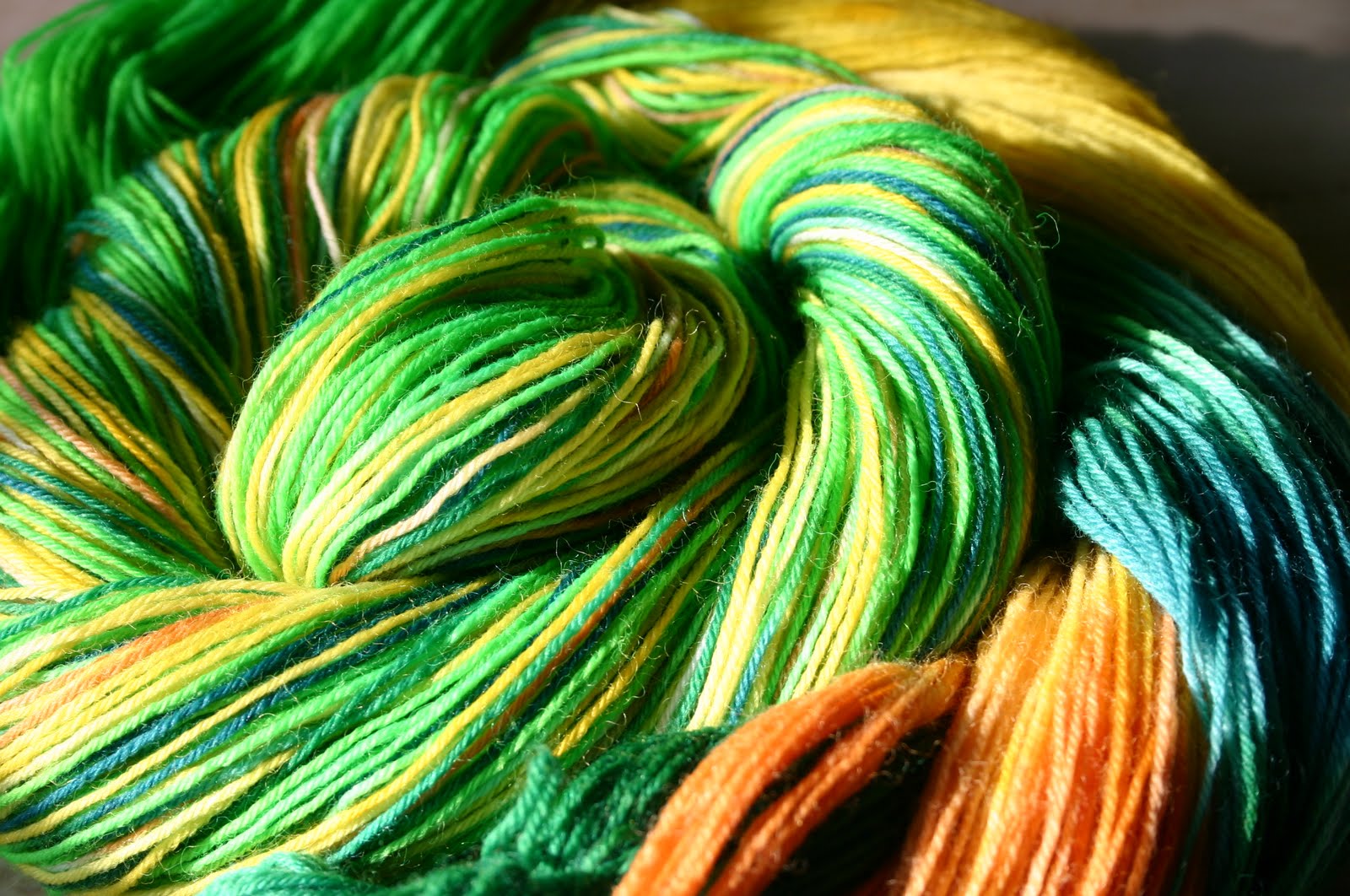
I used a spray bottle to spray blue randomly on the skein before I started adding the other colors in specific sections.  That is why you can see little bits of blue in spots.

This yarn is getting four main areas of burgundy.  As I pour the dye on the individual areas that I want to dye, I use one hand to pour (keeping the container as close to the yarn as possible to avoid splashing) and the other hand works the dye into the fibers by gently massaging it through all of the strands.  You can also vary the results by pouring the dye in just one area and pushing it down the strands.

These skeins have been heat set in the microwave and are now cooling off in the sink.

I left white areas between the burgundy.  In the center of that white area will go a thin stripe of gold.  Finally, I fill in the white areas between the gold and burgundy with a dark blue.

So far, setting up has taken anywhere between 1/2--1 hour.  The actual painting of these skeins has taken between 10-15 minutes.  The final step (heat setting the dyes to make them permanent) takes about 10 minutes.  

When I have finished putting dye on the yarn, I wrap the skein in microwave safe plastic wrap (Saran Wrap is my preferred brand but I have also used Glad Press-n-Seal in a pinch).  Depending on the color placement and how much you want or don't want the colors to bleed on each other determines the method of wrapping with the plastic.  Generally, when I know I am going to be painting the yarn I cover the whole work space with plastic wrap.  Then, as I finish each section of yarn I can roll it up from the outside edge and help keep the colors from bleeding too much.  Unless I want it to blend together.  There really are no right or wrong answers here.

But, however I have wrapped the yarn, I give the whole package another layer of wrap just to make sure it doesn't leak all over the inside of the microwave.  Once it is cocooned in plastic, it is placed in the microwave and heated for two minutes on high power.  When the microwave beeps, I open the door and just let it sit there cooling for three minutes.  Then I repeat the process again.  Sometimes I turn the yarn package over.  Sometimes I don't.  Total time is now 10 minutes.

Make sure you are wearing gloves when taking the yarn bundle out of the microwave.  It will be extremely hot at this point and some steam may leak out of the plastic wrap.  BE VERY CAREFUL to avoid burns.  I drop the bundle in the empty side of the sink and just go on with other colors while it cools.

After the yarn has cooled for about 20 minutes or so, I remove the plastic wrap.  It is still pretty hot.  If there is more than one skein I separate them and leave them in the sink to cool to room temperature (see the picture above).  Once they are at room temp they can be rinsed.  The rinse water should be at least as warm as the yarn, or warmer to avoid felting.  Warm/hot water causes the individual wool fibers to open up at the end.  Cold water causes the ends of the fiber to close down on one another.  It is not the warm/hot water that causes felting, but the repeated opening and closing of the fibers when shocked by temperature changes in the water.  Friction (or agitation) of the fibers helps speed up the felting process by tangling the ends of the fibers while they are open so that when they close they are permanently twisted together.  So, try to not rub the fibers much while dying and rinsing  but be especially mindful of temperature changes in any of the liquids you are working with.

Once the water rinses clean, gently squeeze out as much of the water by hand and then hang the skeins up to dry.  If you have the space, and the weather is nice, go ahead and hang them outside.  Direct sunlight can damage or fade the yarn if exposed for long periods of time.  But the time it takes the skeins to dry will only be a few hours if in the sun, or if there is a breeze so go ahead.  Besides, freshly dyed yarn looks so pretty blowing in the breeze.

Any questions?

Thursday, March 4, 2010

Dyer's Notes:Polo Ponies and Georgia Peach

I knew ahead of time some of the colors I was going to be dying.  The first one on my list was Sophisticated Schoolgirl.  I have dyed this color twice before and sold it instantaneously.


Then, I knew I wanted to do a masculine, darker yarn.  The last two pair of socks that I have made for Addison have been with these warm brown sort-of mixtures.  When I was deciding which colors to use for this, I was reminded of horse colors.  Chestnut, brown, black, bay.  And so they named themselves.  I liked this color combination in theory but the reality of how they turned out exceded my expectations.  I love the dark purple quality of this yarn and can't wait to see how the colors play off of each other when knit up!


But the biggest surprise for me was Georgia Peach.  Someone had commented that the color they most wanted to see was peach.  Since I don't have a specific peach colored dye I made my own (yes, I take notes so I can do it again).  A few of the skeins were dyed in a kettle manner rather than being painted.  This color was one of the kettle ones.  I used the dye in a very diluted concentration and then added some of the full strength as well as some pink selectively.  Now, while I love the color pink, I am not a pastel person.  Nor am I usually wowed by the color peach.  But, I've got to tell you, I am smitten with this color.  Somehow, it is rich and yet subtle at the same time.  I'm not sure that's really possible but there you have it.


Next up: Early Autumn and Summer garden


New Sock Yarn Colors

Ok, so this morning we had a mini photo shoot of the new colors.  I say "we" because my shadow trusty assistant supervisor was making sure I got it right.


I actually owe him a thank you.  It was seeing him sunning himself in the window that made me realize how much better the light was over there.  I've never used the ledge as a place to put the yarn but it seems to have worked out quite well.  I dyed a new batch of "Sophisticated Schoolgirl" and also did six new colors.  Check out the colorway page for a look.  I will be doing additional posts with notes on the new colors later.  This evening or tomorrow I will be doing a few more new colors.  If you are really craving a particular color and I haven't done it yet, just let me know and I will make sure it happens in the next round of dying.